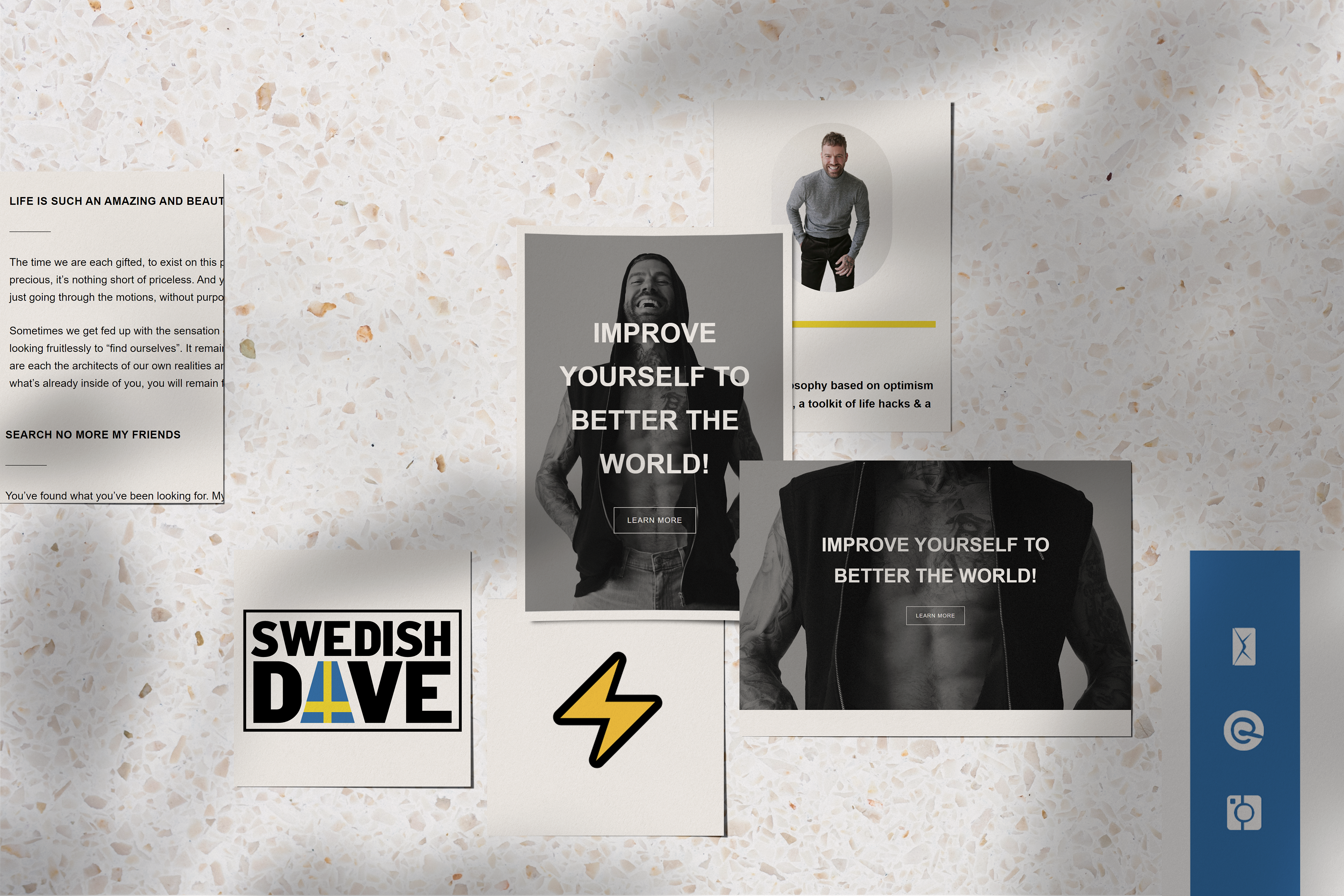
After gathering a small following on Instagram, Swedish Dave was ready to build a strong cohesive brand and grow his audience.
Yellow and blue were obvious colors for the palette. The trick was finding the right hue. The colors needed to be rich and bold, not flashy and cheesy.
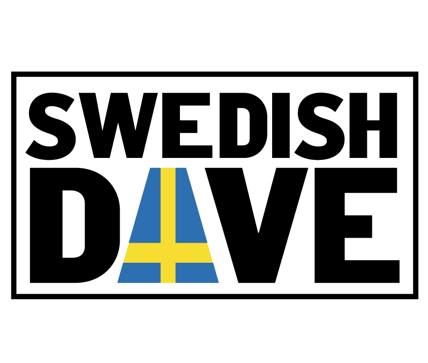
Swedish Dave lives and breathes his brand. The proof is in the ink. It felt only fitting to incorporated his tattoo into the logo. The logo was designed to feel like an import stamp. With big bold tight lettering squared off in a nice frame, keeping on brand with Swedish Dave's big impact.
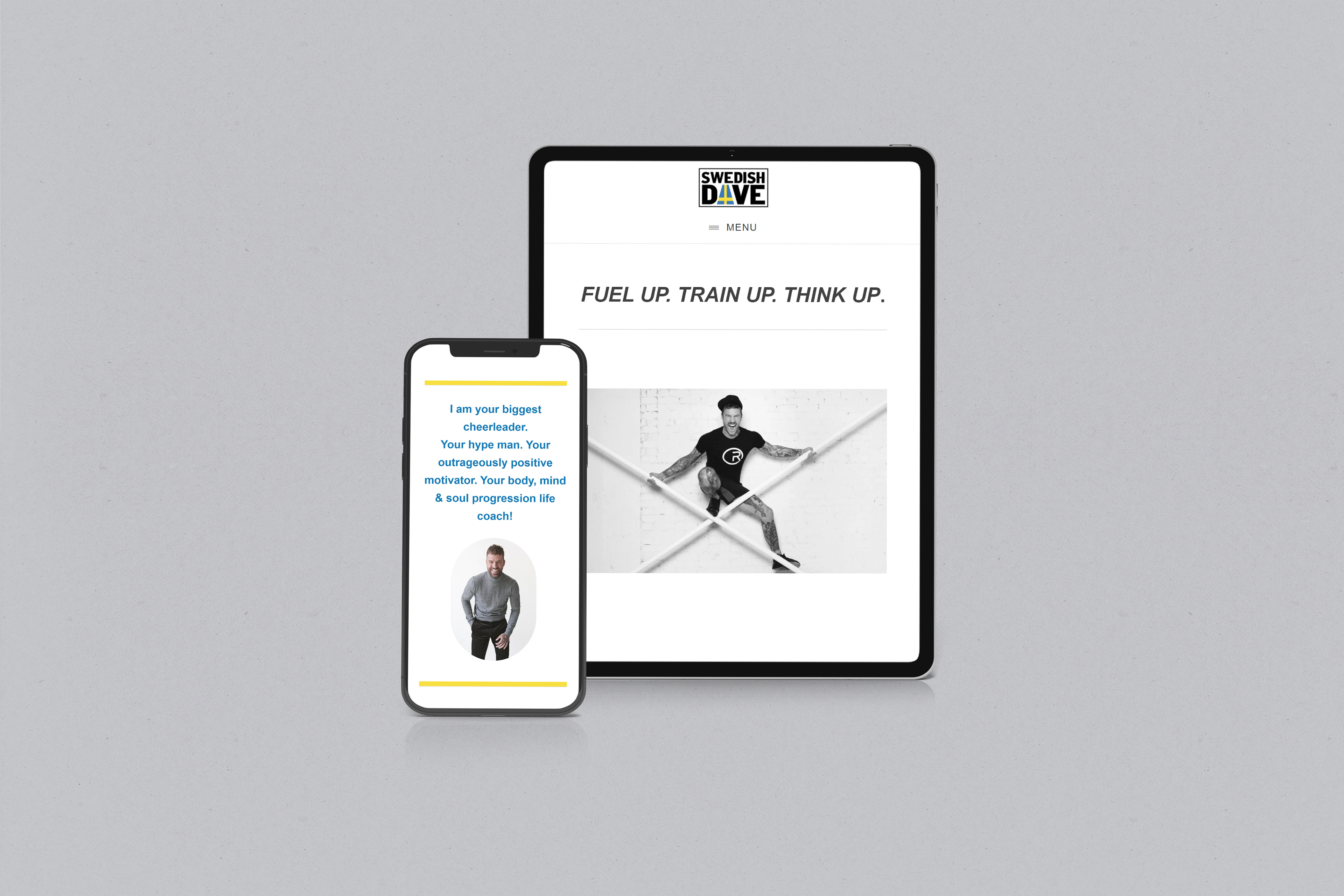
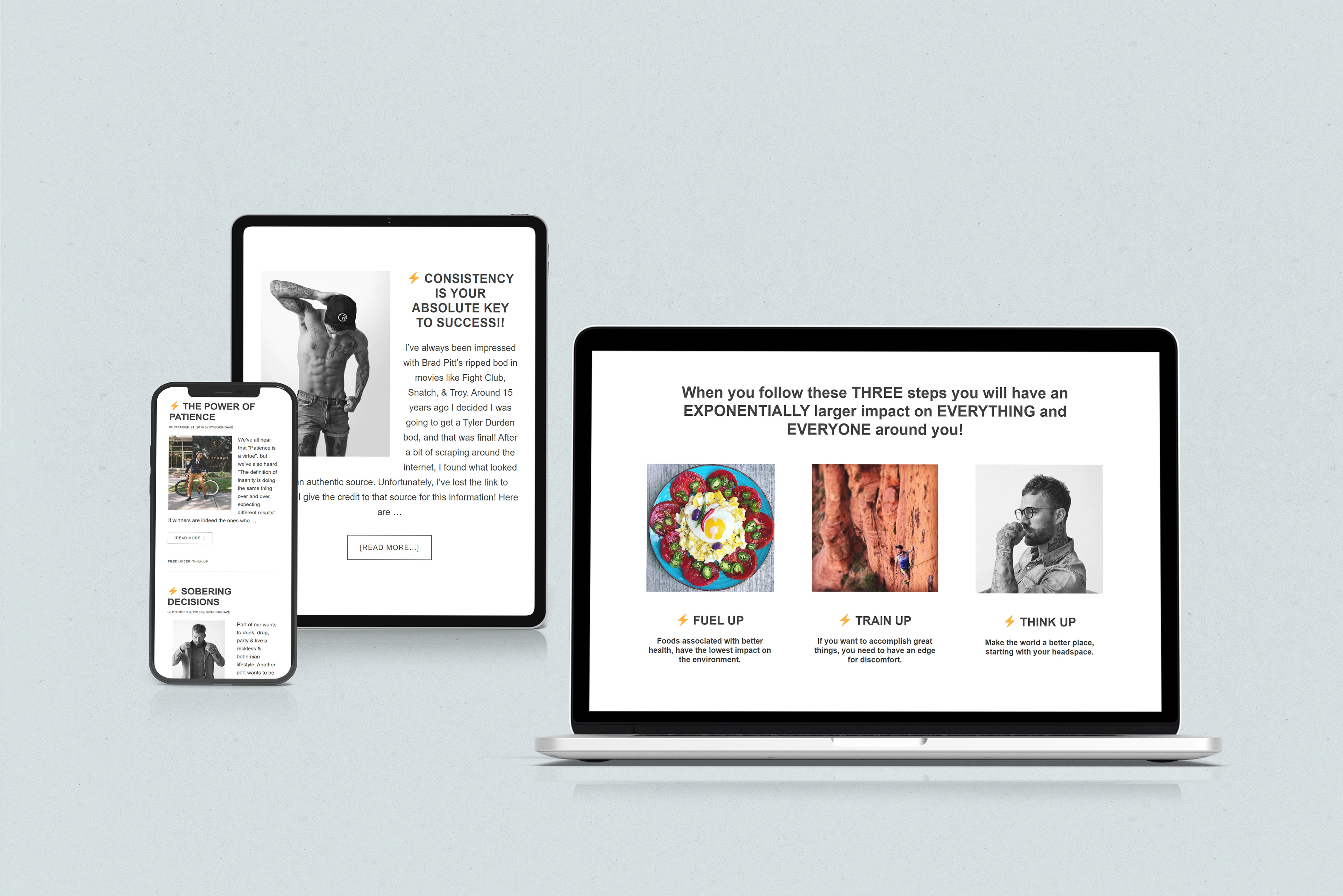
Having a bold, minimal black and white website design with carefully curated pops of color enriches the brand voice and complements the content.